Settings UI design inspiration
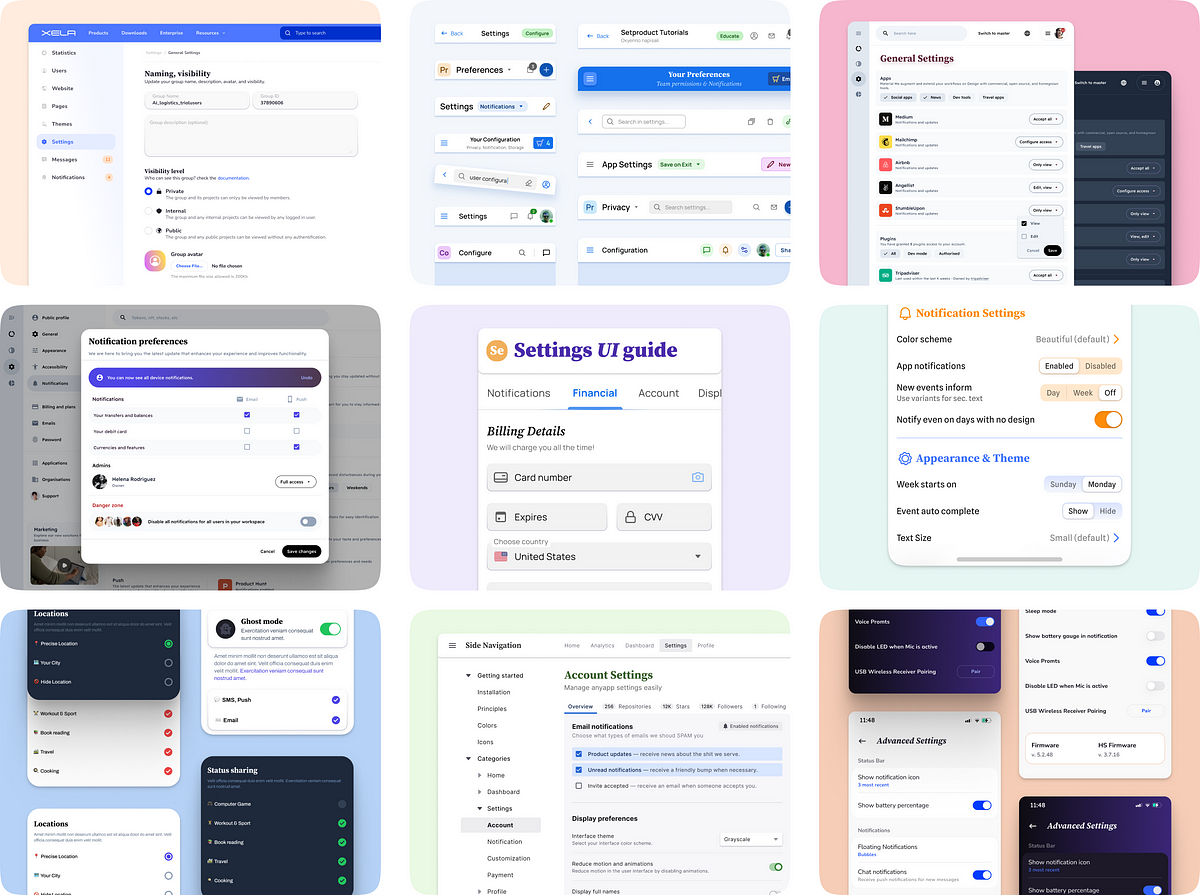
Settings UI Design Inspiration
The app settings UI section is a crucial part of any application, allowing users to personalize their experience by adjusting various preferences and configurations. In this article, we will explore the key components of a settings section and how they contribute to an efficient and visually appealing design. We will also delve into real-world use cases, different layout types, and best practices for organizing settings effectively. Finally, we will provide essential usability tips to ensure seamless navigation and effortless customization within settings sections.
Anatomy of a Settings Section
The settings section typically consists of various components, including:
-
Header: The header contains the name or icon of the settings section, providing users with a clear indication of where they are.
-
Navigation Menu: A navigation menu allows users to easily switch between different settings categories or sections.
-
Preference Controls: Preference controls, such as switches, sliders, or dropdown menus, enable users to customize their preferences and configurations.
-
Information Display: This section can display relevant information or feedback to users regarding their settings changes.
-
Save/Apply Button: A save or apply button allows users to confirm their settings changes and apply them.
-
Back Button: A back button provides users with an easy way to navigate back to the previous settings section.
Real-World Use Cases
Settings sections can be tailored to various applications or platforms, including mobile apps, web applications, or desktop software. Examples include:
-
Mobile App Settings: Customizing notifications, privacy settings, display options, or account preferences.
-
Web App Settings: Configuring user profiles, security settings, language preferences, or accessibility options.
-
Desktop Software Settings: Adjusting display settings, audio controls, network preferences, or system configurations.
Layout Types and Best Practices
There are different layout options for settings sections, each with its own advantages and disadvantages:
-
Tabbed Layout: This layout divides settings into separate tabs, allowing users to switch between different categories easily.
-
Hierarchical Layout: Hierarchical layouts organize settings in a tree-like structure, with nested menus and sub-menus for easy navigation.
-
Grouped Layout: Grouped layouts group related settings together, creating a visually organized and scannable interface.
Some best practices for organizing settings efficiently include:
-
Prioritize frequently used settings and place them at the top or provide quick access shortcuts.
-
Use clear and concise labels for settings categories or sections.
-
Utilize visual cues, such as icons or colors, to aid in understanding and navigation.
-
Incorporate search or filtering capabilities to help users find specific settings quickly.
Essential Usability Tips
To ensure a seamless user experience within settings sections, consider the following tips:
-
Use clear and descriptive language to explain settings and their potential impact.
-
Provide tooltips or contextual help to guide users through complex settings or unfamiliar concepts.
-
Allow users to preview changes before applying them, especially for visual or UI-related settings.
-
Provide feedback or confirmation messages when settings changes are saved or applied successfully.
-
Regularly assess and update settings based on user feedback or usage patterns to continuously improve the user experience.
By following these design techniques and user-centric approaches, you can create a user-friendly settings UI that enhances user satisfaction and allows for effortless customization.